Triodos Bank
THE BRIEF (DESIGN EXCERCISE)
Triodos Bank, a pioneer in sustainable banking, aims to redefine the role of money for positive change. As stated by the bank, Triodos is not merely a financial institution, but a community united by shared values. Ethical banking customers are typically motivated by strong convictions, and the brand’s tone should mirror this unwavering stance.
THE SOLUTION
While Triodos Bank boasts admirable values, its visual branding could benefit from enhancement.
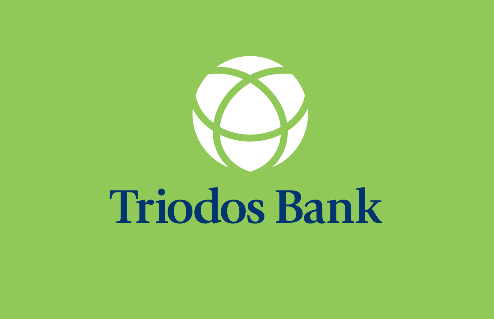
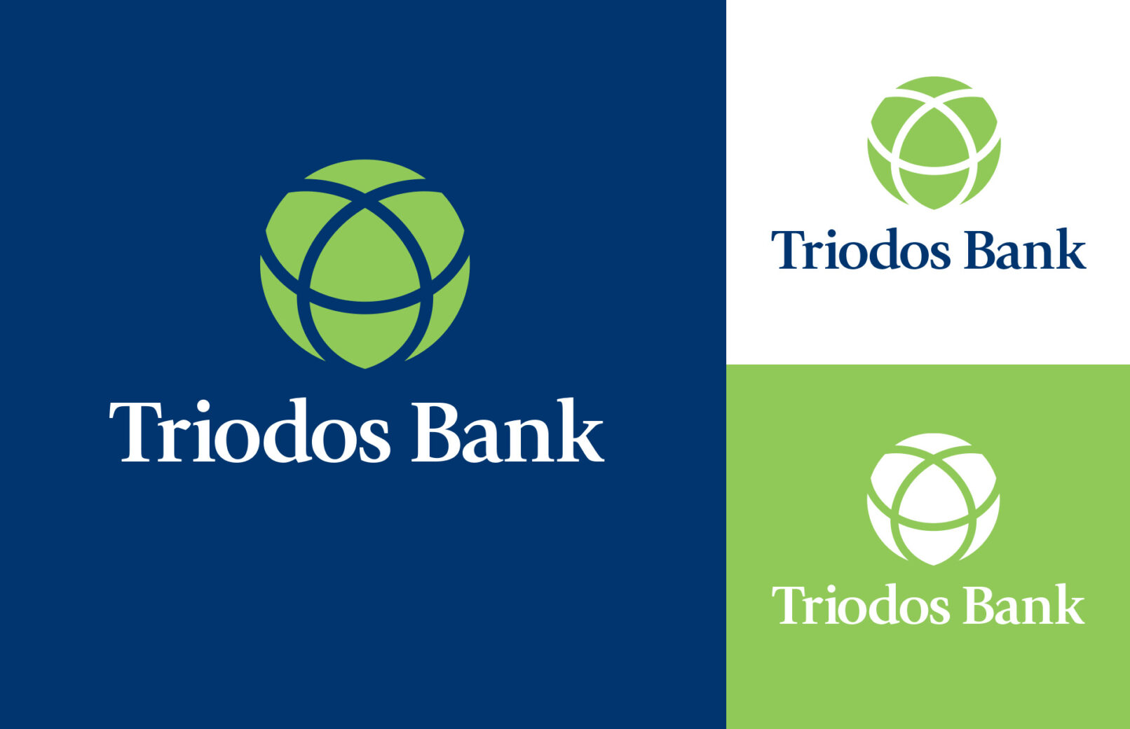
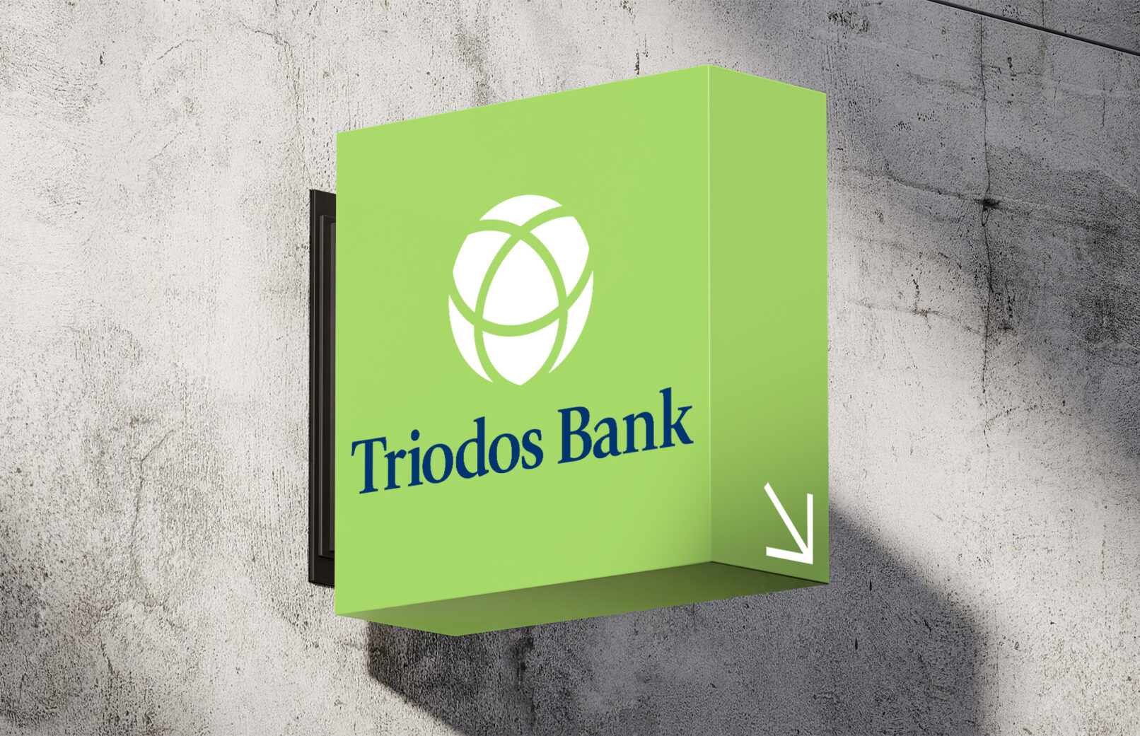
The name Triodos is derived from the Greek “τρὶ ὁδος – tri hodos,” meaning “three roads”, which for the bank are: people, planet, and profit. The bank was initially founded as an anthroposophical initiative with a mission to promote quality of life in the broad sense. In preserving the essence of the logo, I’ve opted to retain the three interlocked circles – the icon has been refined through rotation and the removal of sharp edges for a more polished and softer appearance.
Their current logo bears a resemblance to symbols associated with hazard or danger – this could be deliberate to invoke a sense of urgency, but this signalling contradicts the bank’s environmental and ethical stance and it’s also important to steer clear of any imagery that evokes any sense of risk or uncertainty
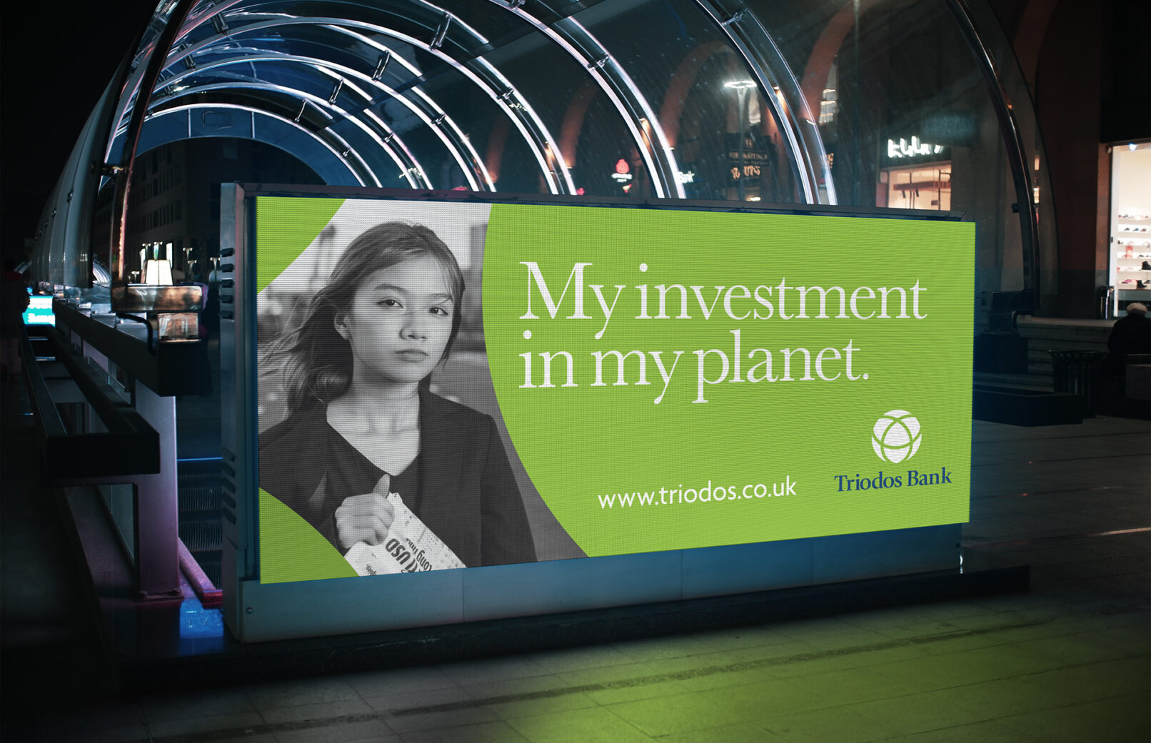
The sense of urgency in its branding, which is achieved through vibrant colours and a bold tone of voice. Through clarity, directness, and visual refinement, the new branding aims to connect with both current and prospective customers who prioritise making a positive impact through their banking decisions.


